Skip to content


Note: This blog was updated January 2025.
When designing websites, it’s important to make sure that you’re creating sufficient color contrast. This post will break down why contrast is important and how to check your web pages, and give some examples of good – and poor – contrast.

Color Contrast in Web Design: How to Stay Accessible (WCAG 2.1)
Why Color Contrast Is Important in Web Design
Color contrast is part of a broader set of web standards that fall under the umbrella of accessibility. They’re meant to make sure that everyone – including those with visual, motor/mobility, auditory or cognitive impairments, or seizures – are not presented with barriers that prevent interaction with websites.
The current prevailing standard for web accessibility in the United States is the Web Content Accessibility Guidelines (WCAG) 2.1, which became the recommendation of the World Wide Web Consortium (W3C) in June 2018.
There are also governmental standards. The most prominent of these is Title III of the Americans with Disabilities Act, which covers all businesses, state and local governments, and nonprofit organizations. The General Services Administration’s Section 508, meanwhile, covers web accessibility for government agencies, federally funded nonprofits, public higher education institutions and public K-12 schools.
It’s common to hear “ADA-compliant” as shorthand for a site being accessible. ADA Title III is also the source of the 10,000+ federal lawsuits filed against non-accessible websites each year.
For this post, however, we will focus on WCAG 2.1 color contrast standards. Several countries have adopted WCAG standards as official, and Google’s Lighthouse tool uses success criterion 1.4.3 from WCAG 2.1 as its standard for contrast.
(We’ll get into Lighthouse more in a bit.)
Accessibility is About More Than Compliance
Sure, it’s important to stay compliant. Critically important, in many cases. But really, web accessibility is about doing the right thing.
Ideally, we as marketers and web developers should strive to make information accessible to everyone. You might find WCAG 2.1 standards to be rigorous. They are … and for a good reason.
Now, your site probably isn’t perfect, particularly when it comes to color contrast. Almost none are. Heck, W3’s site doesn’t always pass all accessibility standards.
That doesn’t mean you shouldn’t strive for 100% accessibility and proper contrast. Don’t panic, and don’t give up – make the changes that need to be made.
Here’s a great explainer from W3C.
How to Check Your Site’s Color Contrast
The easiest way to check color contrast on your site is to run it through Lighthouse, Google’s open source tool for user experience improvements. (You can find a fuller description of Lighthouse, which is a great SEO tool, too, in our post about the “Links Do Not Have Descriptive Text” error.)
The easiest way to get to Lighthouse is web.dev/measure. You can also access it:
- With a Chrome extension
- In Chrome DevTools
- From the command line
- As a Node module
Once you have Lighthouse called up, here at the steps to check a web page for proper color contrast:
- Run a Lighthouse audit.
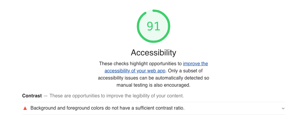
- Look at your Accessibility score. If it’s 100, you’re definitely good. If it’s not, scroll down to the Accessibility details section.
- If there is an issue, you’ll see a red triangle and the message “Background and foreground colors do not have a sufficient contrast ratio.”
- Click this message to open it up. You’ll see the areas or words where contrast is insufficient.
What This Message Means
Lighthouse is identifying elements on the page where the contrast between foreground and background elements is below WCAG 2.1 Success Criterion 1.43. Those standards are:
- Text and images of text must have a contrast ratio of 4.5:1.
- Large text (18 point or bigger, or 14 point or bigger when bolded) must have a contrast ratio of 3:1.
“Incidental” text (i.e., pure decoration) and logo and brand elements are exempt from WCAG 2.1 contrast requirements.
Helpfully, Lighthouse will tell you exactly what text and elements fail WCAG 2.1 1.43 standards.
Here are some examples:
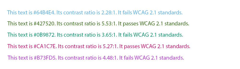
The point? The line between text that passes and fails WCAG 2.1 color contrast standards is thin. And you usually can’t tell by eye if something is going to be OK.
Fixing Your Site’s Color Contrast
Chances are, you’ll find contrast issues on at least one page of your site. Lighthouse will tell you exactly where the issue is.
The only sustainable way to fix a contrast accessibility is to change the size of your type, or change the color of your type or background. There’s no way to “trick” the minimum standards – nor would you want to, as the goal is to provide maximum accessibility.
We can’t tell you exactly what to do, but remember the magic number of 4.5:1. That’s the contrast ratio you need for any type smaller than 18 point (or 14 point bolded).
WebAIM’s Contrast Checker is a great tool for this. Simply enter the hex codes for your text and background, and it will spit out the contrast ratio.
The ColorPick Eyedropper Chrome Extension is a great way to quickly identify colors on your site. If you only need the text color, you can use the WhatFont Chrome Extension.
tl;dr – Key Takeaways
- Web accessibility standards have been developed to make online information and tools more useful to all populations.
- Website owners and developers should strive for maximum accessibility. Perfection is difficult to achieve, but a good faith effort is absolutely something that should be done.
- Google’s Lighthouse tool will identify accessibility issues, including color contrast problems.
- The minimum acceptable contrast for most text is 4.5:1.
- The WebAIM Contrast Checker will tell you the contrast between two colors.
- The only way to fix the issue is to make your text bigger, or to change the color of your text or the background.