You’ve heard that visual content is far more effective on social media than words alone. So how do you make blog images look good on Twitter, LinkedIn and Facebook?
It’s happened to every content marketer. They spend hours on a blog post. Doing their research. Agonizing over every comma. Finding just the right picture to make their point.
Then they publish it and post it on social media.
The result?

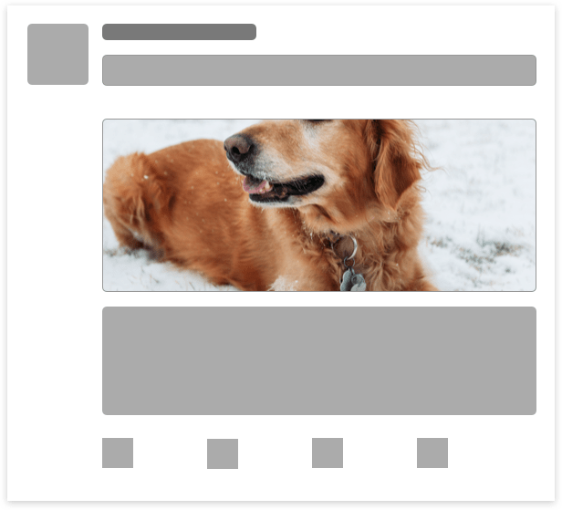
Why didn’t it crop correctly? He’s a good boy! He deserves a better crop!
This scenario is a result of a blog image that isn’t optimized for social media. In this post, we’ll teach you how to do it right.
WordPress Featured Image: A Near-Universal Fix
In a bit, we’re going to dive deep into each network. But if you use WordPress and you’re OK with “good enough,” here’s the golden rule:
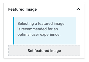
Use a 1200x675px featured image.
Save it down and upload it here:

Seriously. It’s that simple.
1200x675px is a 16×9 aspect ratio. That’s pretty close to what LinkedIn, Twitter and Facebook are looking for. They’ll size it down and display something that’s darn close to what you want.
Will it be identical on all three networks? No. Social media image sizes vary. But if you don’t feel like creating multiple images, this will do what you want.
The featured image is not a magic bullet. You can’t just put anything there and have it show up looking good. What happened to our dog above is almost always because of a poorly sized featured image. Remember: You’re looking for something around a 16×9 aspect ratio. If you put in 4×1, it’s going to get cropped in a nasty way.
Want to get granular? Here’s a deep dive into how each platform works with regard to blog images.
How Social Platforms Choose the Image to Display
LinkedIn, Twitter and Facebook all have their own ways of picking the image they’re going to show. There is a commonality between them, though. If you don’t tell the platforms what picture you want with your post, you’re leaving it to chance.
And this is not something you want to leave to chance. Look at the pupper a few paragraphs up. He’s not attracting clicks and engagement. It’s off-brand, and it’s a wasted opportunity, since visuals matter a ton on social media.
Telling Twitter Which Blog Image to Use
Twitter uses a metadata structure called Twitter Cards to let users build rich content on their websites. This structured markup lets you choose between four types of posts on your blog:
- The Summary Card shows an image and a description under the tweet
- A Summary Card with Large Image is the same, but … with a large image
- The Player Card embeds an audio or video file
- The App Card includes an app download section
For the purposes of optimizing images for social media, we’re talking about the Summary cards.
There are two ways of adding Twitter Card markup to your post.
You can add the HTML by hand. It’s pretty simple syntax. “twitter:image,” for instance, is used to tell Twitter which image to use in the card. (The network also respects Open Graph markup, which we’ll get to in a bit.)
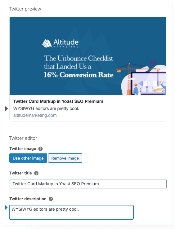
It’s more common, however, to let the CMS add Twitter Card code. The most effective way to do this in WordPress is to use Yoast SEO Premium. This plugin lets you create Twitter Cards on the fly without touching code. Plus it previews the way your post will look on Twitter without leaving the blog.

The Yoast Twitter Card interface couldn’t be easier. You click on “Social,” then pop open “Twitter.” Pick your image and (if needed) modify your title and description.
Image Size & Aspect Ratio for Twitter Cards
Twitter Cards support an aspect ratio of 2:1 – close enough to 16:9 that you can often use the same image. The minimum size is 300x157px, and the maximum size is 4096×4096 pixels.
Twitter Card images must be under 5 megabytes. It supports only JPGs, PNGs, WEBPs and GIFs. Animated GIFs won’t play – just the first frame gets shown. Sorry, no SVGs.
Telling Facebook Which Blog Image to Use
Facebook uses Open Graph markup to choose the image to show with your post. (If you’ve ever looked at source code, Open Graph is the metatags that begin with “og:”.)
The markup to declare a blog image for Facebook is:
<meta property=”og:image” content=”image URL”>
You can add Open Graph markup to your HTML by hand. It’s more common, though, to let your CMS do it.
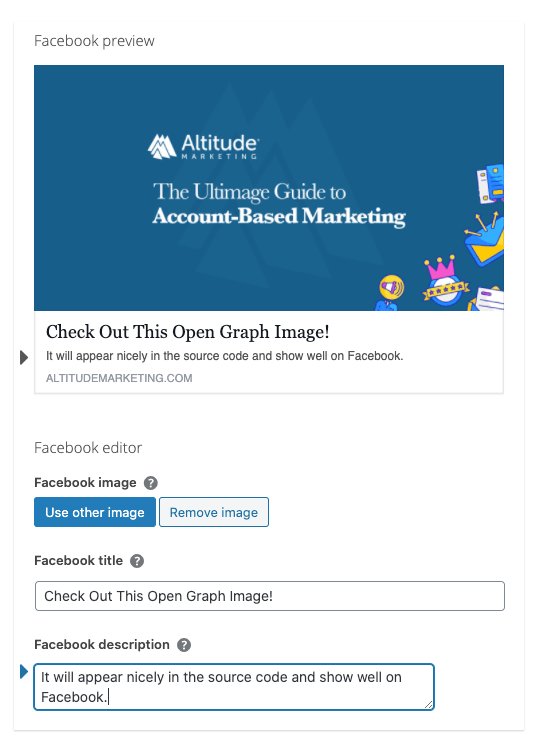
There are a bunch of plugins that will do this for you. But just like Twitter Cards, we prefer Yoast SEO Premium, since it offers a real-time preview.

Image Size & Aspect Ratio for Facebook
Facebook recommends a 1200x630px image. This is slightly different from Twitter’s 2:1 aspect ratio, but close enough that you can use the same image. There are a few variations for other post types, but they’re pretty minor.
Telling LinkedIn Which Blog Image to Use
Just like Facebook, LinkedIn looks for Open Graph markup to determine the image to use. The code is the same:
<meta property=”og:image” content=”image URL”>
Yoast SEO Premium doesn’t offer a LinkedIn option. Instead, use the Facebook editor; it’s the same markup. All the other Open Graph plugins will work, too.
Note that LinkedIn is pretty aggressive in finding and caching images. If you don’t mark your post up, it’s common to see it grab the wrong picture and not let go. If you’re posting your blog to LinkedIn, make 100% sure it has Open Graph tags added.
Image Size & Aspect Ratio for LinkedIn
LinkedIn recommends a 1200x627px image. This is a little bit off Twitter and Facebook, but it’s close enough to use the same picture.
Blog Images on Social Media: tl;dr
You spent a lot of time on that blog post. Don’t get lazy with imagery.
If you want a quick and dirty solution, just use a 1200x675px featured image on WordPress. It will appear fine on all the networks.
If you want to get specific, create a Twitter Card and Open Graph markup using a plugin like Yoast SEO Premium. This gives you granular control over exactly what the networks will show for you.


