When it comes to web marketing, there are two words that stick out: “Wow me.”
Without fail, I have heard those two words emerge from a client’s lips at least once a year for the last (actual years redacted) years I’ve spent as a designer. That quote is usually accompanied by words like “provocative,” or a term like “Web 2.0.”
Regardless of industry, I’ve come to understand that people have creative opinions and styles, whether they know it or not. We all have a favorite color or a favorite song, and neither of those attributes requires an accredited color theory class or music degree from Julliard, respectively. People are creative creatures, full stop.
However, clients don’t hire Altitude for a nod in agreement at every idea that they’ve seen on other companies’ websites. They hire us because we have a track record for understanding branding and growing B2B technology companies through smart use of integrated marketing strategies. We appreciate our clients’ opinions, and always strive to take their suggestions into account. It is, after all, a partnership.
Still, clients will bring up “The Top Web Trends for 2018™” and sometimes want to incorporate those trends into their sites.
And it’s my job to know the trends, understand them and implement them where appropriate … responsibly and with best practices in mind. It’s also my job to deliver a site – a brand identity – that will carry the client to their intended goal without potentially alienating their customers, diluting their message, or just plain missing the point.
That stage set, let’s take a look at some of the big trends for 2018, and get to the root of why they’re good, why they’re bad and when it prudent (and not prudent) to use them.
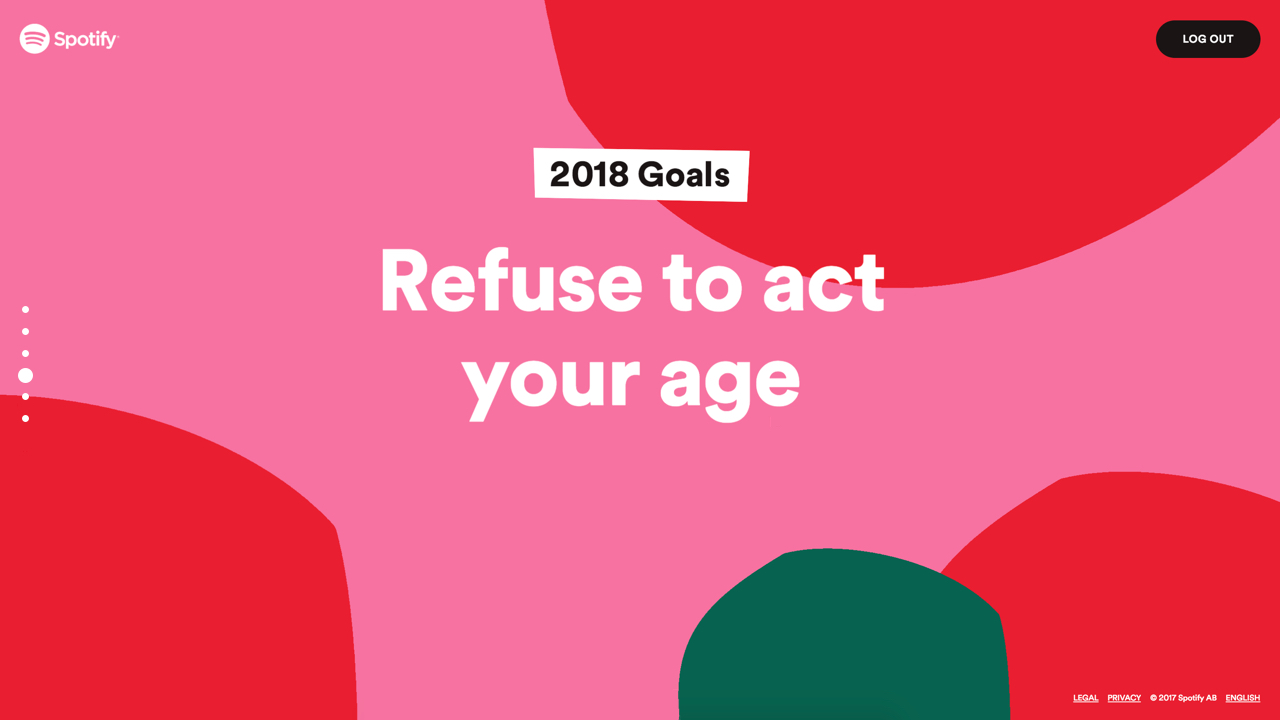
Web Design Trend 1: “Bold, Vibrant, Saturated Colors and Gradients!”
“2018 is definitely the year for super excess colors online.” – 99designs
via spotify.com
One of the biggest trends we’ll continue to see this year is the use of gradients and big, bold color choices. Large swaths of color with bold, knocked-out typography certainly make a dramatic impact. And, as monitors and displays improve, those colors only become more and more vibrant.
Besides the overall visual impact, there are some pretty salient reasons to employ the use of bold colors, gradients and type. For one, large color elements can often be achieved by using CSS and not images. The fewer images you need to use, the faster the page will be. Additionally, because color blocks and large typography can be achieved using code, the better those elements will respond on mobile devices.
Downside? If you go big and bold and colorful, you need to be able to tell a bold narrative along with it. Have an older brand identity or style guide? Might be time to revisit legacy elements in order to reflect your new bold look. Otherwise, the whole picture could feel disjointed and unfocused.
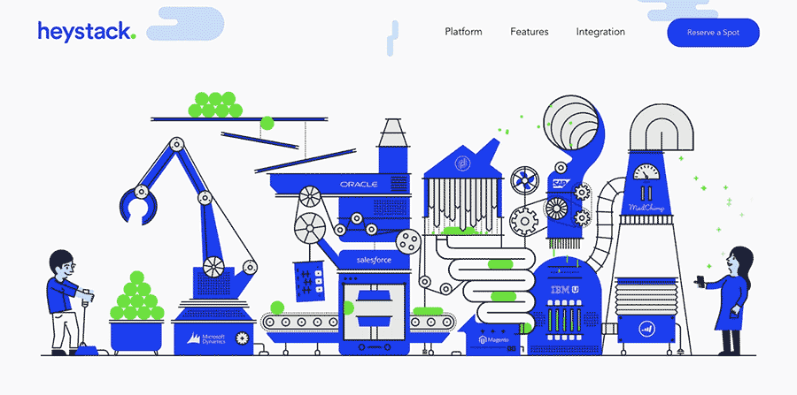
Web Design Trend 2: “Animation!”
“For 2018, animation is very much in.” – Forbes
via heystack.is
C’mon. It’s animation! Who doesn’t love animation?!
When used responsibly, animation is a powerful tool. Page transition SVG animations help the viewer stay engaged. Animated logos – if subtle – are a wonderful way to enliven your brand, and make your site feel more interactive. Making elements of your site bounce, shake, move and transform provides visual appeal in a way that won’t bog your site down. Moderation is the key.
Downside? Honestly, for a time, the concept of animation was a dangerous venture because older browsers (ahem, Internet Explorer) simply wouldn’t support it. Luckily, those browsers have become obsolete, so the web is open for animation. But, remember that thing I just said about moderation? Sometimes moderation is a hard concept for folks to grasp, and before you know it, your website is Times Square. Rule of thumb: Smart, frugal use of low-weight animated elements are important tools to use for a wonderful web experience.
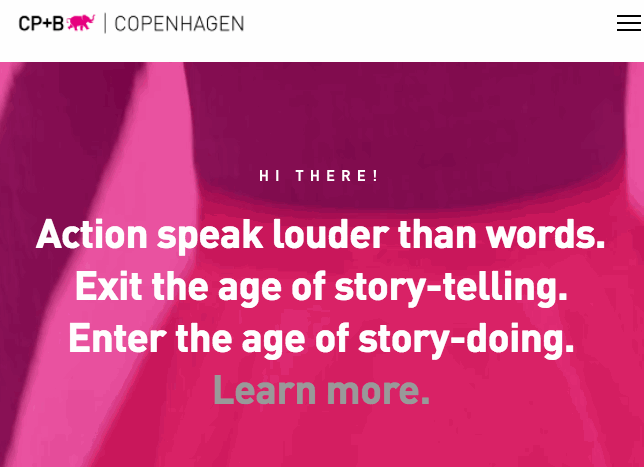
Web Design Trend 3: Cinemagraphs & Video
“Full-screen loops…create immediate interest on an otherwise simple page.” – Hubspot Blog
via cpbcopenhagen.dk
Videos and cinemagraphs (animated GIFs on a seamless loop) are not new to the web at all. Their emergence has coincided with faster networks, better video compression, and easier means to produce, process, and upload videos quicker. Using video as a background for a large area can be an effective way to create visual interest on an otherwise static page. It’s a bold use of real estate that’s usually reserved for a color, or a background image that (hopefully) doesn’t distract the user from the content of the site …
… But sometimes it does distract. One of the downsides to using video elements is that it’s fairly easy to sacrifice legibility for the sake of using a video. And, depending on the contrast of the lights and darks in that video, readability can become a tightrope act. Add a screen to the video to mitigate that contrast, but if you create a screen that’s too opaque, you lose the impact of the video. Too subtle, and the text begins to get lost.
The other pitfall here is page weight. The web, by and large, has come leaps and bounds with its ability to display video quickly, and there’s no shortage of different techniques to implement video as a background element. But, where are you hosting that video? If it’s on your server, the site will need to call to that video, which may slow down your page. Hosting on YouTube, or Vimeo? Well, the page still needs to get a transfer of data from those sites. There are ways to minimize the impact on page load time, but including video on your site is something that should be well thought-out ahead of time.
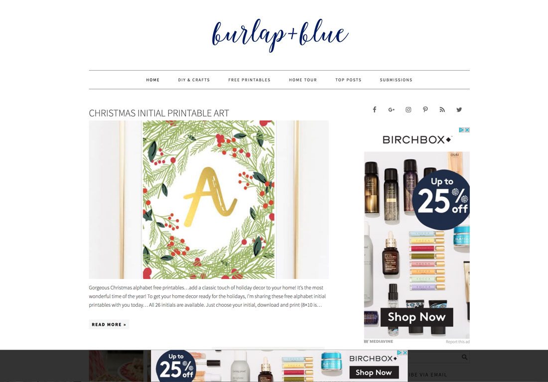
Web Design Trend 4: “Bottom Sticky Elements”
“This less obtrusive location is a prime viewing area and mobile usage has trained users that these types of placements are acceptable.” – designshack
via burlapandblue.com
We’re all familiar with “sticky” headers – website header elements that stick to the top of your browser window as you scroll down the page. They provide the user with the ability to access the site’s navigation regardless of how far they scroll on a page. And, surely we’ve all encountered ads that stick to the bottom of the site – they can feel obtrusive at times, but they’re becoming more and more prominent and commonplace.
Mobile apps, on the other hand, have sticky footer elements almost as a practice. Think of Twitter – it feels natural to have a level of options available there as well as the top. Hell, where do you find your most-used items on an iPhone?
Applying that logic to a website feels like a slam dunk. It gives the user multiple points of entry besides the header without ever feeling foreign – our apps have trained us well. And, if done subtly, this can be an effective tool …
… You already know my caution point, don’t you? Those ads that feel obtrusive? It’s because they’re meant to feel that way. It’s called an “interrupter” for a reason – no ad is ever there to be ignored. Sticky footers can be a huge value-add if you follow the site’s aesthetic, show visual restraint, and add definitive value.
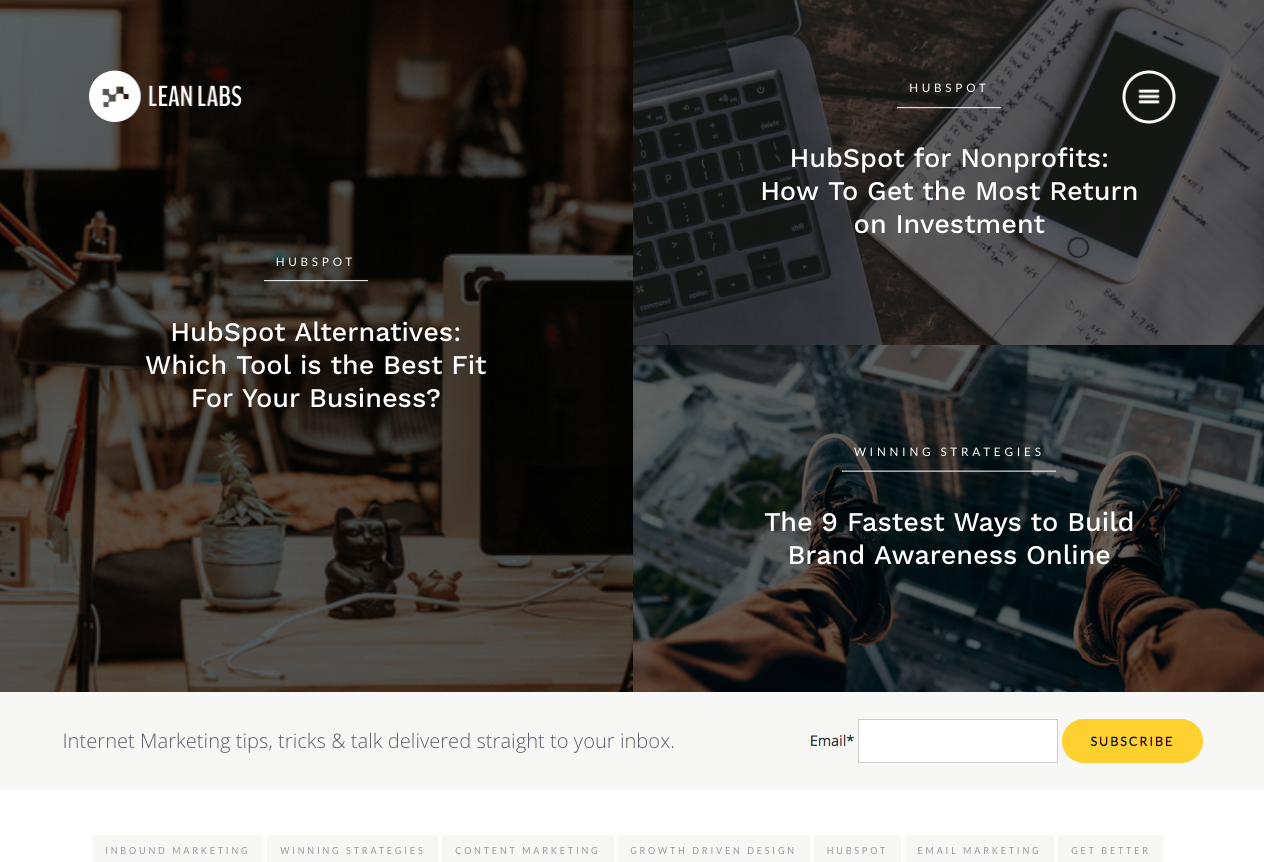
Web Design Trend 5: “Mobile First!”
Since 2016, sites that aren’t mobile-responsive have been penalized by Google, so first and foremost: If your site isn’t mobile-friendly, please take care of that before you start researching design trends.
Already mobile responsive? Great! So, it’s time to start thinking about what truly separates websites from mobile apps. In truth, the divide between the way we approach user experience on a website versus how we approach UX and user-flow in an app has lessened over the past few years, and trends clearly point to that divide continuing to shrink. In fact, 2017 was the first year that people were actually more apt to view your site on their phone than any other device — desktops and laptops included. This paradigm shift forces web designer and UX architects to tailor your web experience as if it were being viewed on a phone, first and foremost. And that means using more mobile tactics on the website.
via lean-labs.com
One such example is the “hamburger” navigation. This delicious-sounding moniker has to do with the three horizontal lines that typically indicate that, if a user taps it, a navigation for the website will appear in frame. Mobile developers use that tactic to save on visual real-estate: smaller viewport = less physical space. More and more, though, this mobile-first navigation has begun to seep its way into the common visual web vocabulary. People have become accustomed to tapping in the upper right of the screen to show them the navigation for the site. The best part of this is that the designer is no longer limited with space for navigation – the “flyout” navigation that appears as a result of the user-initiated action (tap or click) can be as large or small as design calls for.
Another byproduct of “mobile-first” developing on an elastic grid is the idea of a full-screen design. Elements extend themselves from the far left to the far right, regardless of their screen size. The old days of designing sites not to extend past 1080px wide to account for smaller screens are gone!
… But not to everyone. Look, all of this is a foregone conclusion to us. But some users find mobile navs confusing. They want to see all nav items populated above the hero image, and that’s that.
“How will a user know to click in the upper right?” they will ask. Tell them that it’s intuitive, and guess what? To them, it’s not intuitive – it’s another barrier to entry for a potential client. Full-screen design? “No one wants a website that fills up the whole screen – how will they know to keep scrolling if there’s no pre-defined ‘below-the-fold’ region?”
One could call that point-of-view antiquated, but we, as visual communicators, must take such comments to heart. We have to account for the pushback and be able to produce a rock-solid rationale for what we do. Every designer’s decision must come equipped with motive and clear intent. It’s one of the (blessedly) few times where the designer must become a salesperson.
As long as the web has existed, web designers and developers have had the goal post moved further down the field, so to speak. And those who are not nimble to the changing nature of the web are left by the wayside. We need to know where the web is moving to, what viewers expect to see, and what’s going to track as “visually stunning” for a long time coming. We need to know these trends, sure, but like any good tool, we need to know when to employ them.
Every client is different. Each comes with their own history, value proposition, style guide, mission statement, and a whole set of other intangibles to boot. As much as it’s the creatives’ job to explore the future, it is equally, if not more crucial, to fully understand the client’s visual needs – not just now, but a year from now. What devices do their potential clients, or current users view their site on? What are their competitors doing on their sites? What works with their style guide? What trends can we utilize, and which ones just don’t make sense? We have to ask these, and so many more questions, when we architect a web experience.
It’s why the expression “wow me” is so misguided.
Depending on the industry or market the client is in, their users or potential clients may not need to be “wowed” by avant-garde splashes of color or bolder-than-bold typography. They may not long to experience a site that moves, and shakes, and reacts to every cursor stroke. But, what I can assure you they do want is an experience that feels effortless, logical, on-brand, and, yes visually stunning.
A website is a conversation with the client or customer, and our job is to provide the end user with an engaging experience and to fulfill the client’s intended goals in the process. That’s how we “wow” our clients and partners: with results.
Not this:
Amanda Kimble-Evans
Amanda heads the market research and audience insight efforts at Altitude where she uncovers the information clients and their account teams need to message, position and gain more market share. Her ultimate goals are to help clients answer the questions prospects have, stay one step ahead of competitors, keep abreast of relevant trends, and even take advantage of new opportunities in the marketplace.
Amanda graduated from Susquehanna University with a bachelor’s degree in English and double minors in Writing and Women’s Studies.
 Skip to content


