Unbounce is a fantastic tool for building landing pages. But it does a lot more than that.
In this post, we’re going beyond traditional Unbounce use cases, like PPC, eCommerce and email marketing. Instead, we’re going to focus on four unusual ways our clients have put the platform to work for them.
First, however, it’s worth taking a dive into Unbounce itself.
What Is Unbounce?
Unbounce is our favorite no-code landing page platform. It touts more than 15,000 customers, who’ve deployed literally millions of pages.
It’s built around a WYSIWYG editor, letting you build web elements without programming. Pages are hosted on Unbounce’s servers, further minimizing hassle.
Basically, it takes a ton of work out of spinning up custom landing pages. Doing the same thing in WordPress usually requires editing a page template. And designing and coding from scratch just kinda sucks. Whether you start with a template or a blank page, Unbounce lets you create professional results in minutes.
(And yes, we’re an Unbounce partner. If you want to to try it, this link will get you 20-25% off.)

How Is Unbounce Typically Used?
Most marketers using Unbounce are deploying pages for digital ad campaigns. It’s pretty much a perfect tool for that. Conversion rates and ad spend are both heavily influenced by the landing page experience. Unbounce lets you make as many as you want with minimal legwork. That lets you optimize at a granular level, and better connect with diverse audiences.
In particular, you normally hear about Unbounce landing pages being used for:
- Search advertising campaigns on Google, Bing and Yahoo!
- Display advertising campaigns
- Social media advertising
- Email marketing
SaaS and eCommerce companies, in particular, have adopted Unbounce in spades. Both live and die with their digital advertising ROAS, and the platform improves that.
What Does Unbounce Cost?
If you’re not getting a partner discount, Unbounce starts at $72/month for the Essential plan. That gives you 500 conversions and 20,000 visitors/month.
The Optimize plan is $108/month (billed annually). It comes with double the conversions, up to 30,000 visitors and three domains. It also includes Smart Traffic – AI-powered A/B/n testing on steroids.
Accelerate, at $180/month, adds AMP mobile pages and 2,000 monthly conversions, 40,000 monthly visitors, and seven domains.
Scale is the highest standard plan, at $270/month. It’s got 3,000 conversions, 50,000 visitors and 15 domains.
If you need more, Concierge plans let you go crazy with your limits.
Is Unbounce worth it? Think of it this way: Every new conversion is potential revenue. Even for a small eCommerce retailer, one or two sales will likely cover the monthly cost. For an enterprise, one sale could cover years of the cost. So yeah … worth it.
How Do I Use Unbounce?
Here’s our starter guide. That will get you through the typical use cases.
Wait. You Promised Unusual Uses.
And here they come!
Unbounce Use Case #1: A Whole Frickin’ Website
A full custom B2B website build is a 3-4 month affair. Programming alone typically takes 4-6 weeks. If you need to roll a product or a rebrand out now, that won’t do.
Enter Unbounce!
So long as you can make do with a single page, you can absolutely use Unbounce for a full website. There will be compromises – again, it’s a single page. But there are also workarounds. You can, for instance, use lightboxes and smooth anchors for additional information. You can even have analytics, a sticky header, a “menu,” a lead capture form and a blog (so long as you host it elsewhere).
Would we use Unbounce for an enterprise site meant to last years? Probably not. But it’s a fantastic stopgap when time and cost matter. To wit, we’ve stood these up in a few days – and users were good with them.
One tricky part of using Unbounce for an entire site is getting your domain to resolve correctly. They’ve provided instructions for pointing a naked domain via an A Record. This usually solves the issue.
Would we use Unbounce for an enterprise site meant to last years? Probably not. But it’s a fantastic stopgap when time and cost matter.
Don’t forget, too, that you will still need to design your one-page website. Sketch is your go-to for this, since you can export image elements from it and use them in Unbounce. Just don’t forget to compress them.
One final note on using Unbounce for a full website: Watch your break points. Unbounce doesn’t use a full fluid responsive grid to adapt to mobile devices. Instead, it switches to the “Mobile” view at 600px wide. To address this, avoid putting any valuable content or CTAs on the extreme right side of your pages. Otherwise, there’s a chance it could get cut off on smaller monitors.

Unbounce Use Case #2: A Conference App
Both virtual and in-person conferences benefit from a dedicated app. Useful on both desktop and mobile, these can show:
- Agendas and schedules
- Speaker bios
- Organizer contact information
- Late-breaking news and changes
Think of it like a dedicated information repository, whether your attendees are at home or in a conference center.
Problem is, dedicated conference app software can be extremely expensive. (And packed with feature bloat.)
Again, Unbounce to the rescue!
Drag-and-drop functionality makes it simple to put your schedule and other necessities on a single page. Let users scroll between sections – or even dates on the agenda – using smooth scrolling anchor tags. What’s more, if you take the time to style the Mobile view, you’ll deliver an app-like experience to users on their phones.
Think of your app as a dedicated information repository, whether your attendees are at home or in a conference center.
And you can do it all without adopting a new platform or spending a fortune.
We’ve built dozens of these websites/conference apps over the years. Unless you need advanced functionality like real-time polls, they’re pretty great. What’s more, you can leave the Unbounce page up after the fact to memorialize information or distribute session recordings.

Unbounce Use Case #3: Engage Users on Your Main Site
Wouldn’t it be great to be able to automatically reach out to website visitors? You could drive them deeper into the conversion funnel, segment them, or clear up their confusion.
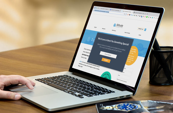
Unbounce does this, too – they’ve rolled out popups and sticky bars.
Sure, there are a ton of popup and sticky bar providers out there. Unbounce was hardly first to market. But it does provide a level of flexibility and integrations that legacy vendors don’t.
Unbounce forms are famously flexible; make them as long or short as you like, with any field type you need
In essence, Unbounce’s popup and sticky bar builder is a mini version of the full landing page editor. That means you can start with a template or a blank canvas, then do just about anything. Most popup builders either force you into a strict template or make you build something custom in HTML.
Then there are the forms. Unbounce forms are famously flexible; make them as long or short as you like, with any field type you need. Contrast this with traditional popup builders, which often limit you to name and email fields. Better yet, you can send this data just about anywhere through Unbounce’s native and Zapier integrations.
The last piece of the puzzle are popup display rules. This is where the magic really happens. You can target users based on a ton of criteria:
- The page they’re on
- Whether it’s their first visit
- How long they’ve been on the page
- If they’re trying to leave the site
- How far they’ve scrolled
- What they’ve clicked on
- How many times they’ve visited
- Their location
- The site that referred them in
- Whether they have a particular cookie on their browser
Put together, this list lets you go after just about any user on your site. For example, you can:
- Offer a phone call for visitors filling out a long form
- Give a coupon to users stuck on a checkout page
- Learn demographic data about visitors reading about your solutions
- Offer relevant premium content to users based on the blog post they’re on
This is a huge addition to any website. We’ve seen it boost conversion rates by 400%. And unlike chat software, there’s no human intervention, or finicky bot to train.
Unbounce Use Case #4: Support a Product Hunt Launch
Product Hunt is the preeminent community of early tech adopters on the web. If you nail your launch there, you’re in for a bunch of traffic, attention and users.
One of the keys to supporting a Product Hunt launch is delivering a custom experience for their users. They don’t want a generic sales pitch. They want credibility, a clear message, and for your “cool” factor to shine.
Unbounce, again, gives you a perfect canvas for this. You don’t need to change your homepage for a Product Hunt launch. Instead, use a landing page (like the one here) and tailor it to your audience.
This isn’t just a Product Hunt tip, either. Any time you need to give specific messaging to a specific group, build something just for them. With a WYSIWYG editor, there’s no reason not to.
tl;dr: 4 Things You Didn’t Know Unbounce Can Do
If it’s not clear by this point, we love Unbounce. And we especially love that it’s not limited to landing pages. Think outside the box, and don’t be afraid to push its limits.
Spin up a website in a day.
Build an “app.”
Get more out of your visitors.
Deliver tailored messaging to specialty audiences.
If you can dream it, you can probably do it!


