Skip to content


Major League Baseball’s All-Star Game is tonight. Naturally, that means it’s time to think about marketing data visualization!
(We’re nerds. What can we say?)
One of the beautiful things about baseball is the dataset that comes with it. Baseball Reference – just about the best site on the internet – has game-by-game breakdowns back to the 1870s. That means there’s an absolute ton of numbers to play with, making it a great way to hone your data skills.
In honor of the All-Star Game, we’re taking the opportunity to run through three charts every data marketer needs to know and love. (By way of technical details, we did our visualization work in Google Data Studio, using CSV data exports from Baseball Reference loaded up in Google Sheets.)
Chart 1: The Bar Chart
Bar charts are classic tools for comparing apples-to-apples data. Bigger = more. Simple, right?
There are a few things to keep in mind with bar charts, though. You usually don’t want to use them when you’re visualizing data over time. For that, you’ll want a time series or area chart (see below) so you can connect individual data points on the x-axis. Additionally, watch the number of points you’re comparing. Beyond about seven and viewers will glaze over everything in the middle.
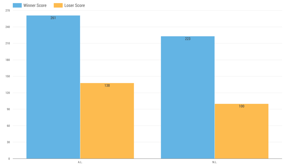
Here, we’ve broken down All-Star Games won by the American League and National League and split out the total runs scored by the winning and losing teams in each. The takeaway: If it’s a high-scoring game tonight, the A.L. is probably going to come out on top.
This is a pretty simple chart to run in Data Studio. Our source dataset looks like this:
[table id=1 /]
We started with “winner” as our dimension, splitting A.L. wins from N.L. wins on the x-axis. Then we added two metrics – “winner score” and “loser score” – run as sums. This served to tally the total winners’ and losers’ score in each of the two categories defined by the dimension.
How Marketers Use Bar Charts in Data Visualization
This is a great chart for lead source analytics. You can use dimensions to split up sources (e.g., website, trade show, networking) and metrics to split up deal stages or outcomes.
Chart 2: The Time Series
Time series are basically bar charts, but with an added dimension for time. This connects the data points from each year, quarter, month, week, day or hour, clearly showing the user the relationship (up, down or the same) between them. You should not use time series for non-time dimensions – they’re meant to be read left to right as change, not comparison.
Below, we show the evolution of the All-Star Game Home Run Derby with the winner’s total home runs plotted on the y-axis and the year plotted on the x-axis. It’s worth noting that the steady rise in homers isn’t necessarily evolutionary; MLB has changed the Derby rules several times, with eyes on adding excitement. It’s clearly working.
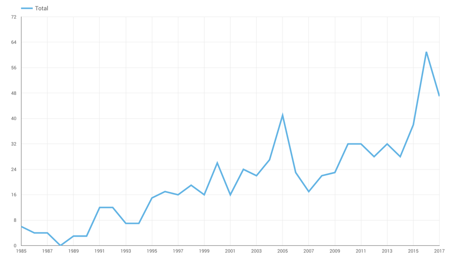
The time series does a great job of showing a progression over time, pointing out gaps in the data (1988’s rainout) and highlighting anomalous events (Bobby Abreu’s before-its-time 2005).
Building a time series in a BI tool like Data Studio is about as easy as it gets. Your time dimension dictates the x-axis, and your metric – always a number – dictates the y-axis.
How Marketers Use Time Series in Data Visualization
The most common uses of time series in marketing data are website traffic and lead flow. Both lend themselves extremely well to the chart type since you’re looking for near- and long-term change as well as the overall trend. If the right side is higher than the left, you’re doing something right.
Chart 3: Area Charts
Area charts are basically time series charts that show comparative volume over time. Essentially, they’re multiple filled-in time series shown stacked or (as below) laid on top of one another. The extra color gives the viewer additional context, visually indicating the data is being aggregated – each year adds to the total.
Here, we look at the offensive WAR (wins above replacement player) for the two leaders among active players – Albert Pujols in blue and Adrian Beltre in red – and 2018 All-Star Mike Trout in yellow. With the area chart, you can see the different trajectories Pujols and Beltre took to their totals – a next-level peak followed by sharp decline for Pujols, and slow and steady for Beltre. Trout is a long way off from their totals but you can see that his best seasons are already better than either future Hall of Famers.
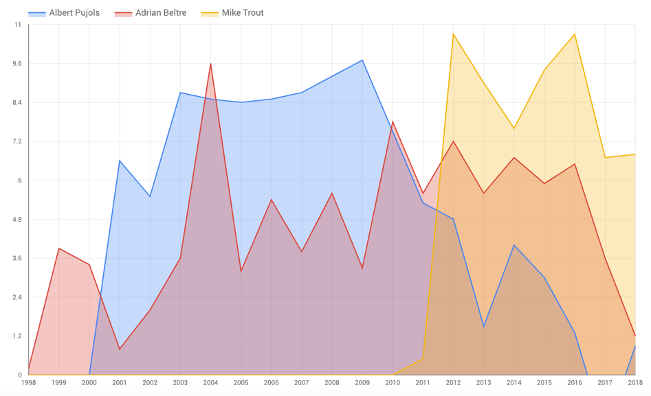
Why active leaders and not folks like Babe Ruth? Remember, area charts work like time series; they need a time dimension. Including Ruth and other players of the past would have added significant amounts of empty space between players making comparison difficult.
How Marketers Use Area Charts in Data Visualization
Area charts are tremendous for examining the efficacy of discrete efforts. What’s driving traffic to the website? Where are leads coming from? Which social networks are driving the most engagement? Area charts are a beautiful, cogent way of showing the data and helping the audience understand what they’re looking at.