 Skip to content


As a marketing agency with a focus on web development, we spend a lot of time talking to business owners about their websites. Since we primarily serve a B2B market, one of the most common refrains we hear is “Should my website be mobile friendly? Nobody would buy from me on their phone!”
The answer: Yes. Your website should be mobile friendly. Here’s why mobile responsive design is important.
Imagine if your sales team ignored half of the customer calls they received throughout the day. Imagine if they ignored 20%. Imagine if they ignored 5%. Would you be OK with that?
The obvious answer is of course not. No company would ever pursue such an ill-advised strategy.
But what if I told you thousands of businesses DO pursue such a strategy, every day – just in a slightly different way. Instead of ignoring half of their phone calls, they ignore half of their website visitors. (This includes the most important one, which happens to be a spider. But we’ll get there.)
Why would a company do this? Because their website is not mobile friendly.
What about your company? Do you know if you have a mobile friendly B2B or B2C website? Take 30 seconds and use this mobile responsive test tool to find out.

Let’s go step by step.
Why a mobile friendly website matters (even for B2B)
Did you know that 51.89% of global web traffic originates from mobile devices? In the coming years, that number will only continue to climb. But if this is the case, why do so many companies (especially B2B ones) ask “should my website be mobile friendly?” and come back with a “no”?
There are two reasons. And we hear them all the time:
- “Nobody looks at our site on their phone.”
- “Nobody does business on phones.”
If you’re reading these and nodding your head in agreement, I’ve got bad news for you. Both of these statements are false. Keep reading and I’ll prove it to you.
“Nobody looks at our site on their phone.”
When hearing this, the phrase that so often comes to mind is never say never. Even if it’s a tiny percentage with minimal frequency, the amount of people who view a B2B or B2C website on mobile is a non-zero number.
Seventy-seven percent of Americans own a smartphone, and plenty have tablets. The odds of someone landing on your website on mobile are high.
Why should you care?
Picture this: a manufacturing plant needs RFID tags to better track their inventory. They kick off the research process on a tablet out of convenience – to stay on the floor instead of trudging up to the office desktop computers – and discover your business, only to further discover a disorganized website with a poor user experience. (Or worse, they don’t find you at all.)
The desktop version of your website may rock, but they don’t see that view. They close the tab and continue their search elsewhere. You’ve lost them.
Here’s another example: a potential future employee is scrolling through job queries on their phone and clicks an Indeed link to your website – but the button to apply has jumped off the page.
Frustrated, they go to a different company site that has an easy, mobile friendly application process. You’ve lost them.
There’s no hiding from this truth: a website that’s hard to navigate will turn away visitors used to accessing easy to navigate information on their mobile device. If your website does not immediately provide the user with what she is looking for – on desktop or mobile – she will quickly leave your site for a competitor’s.
By providing a bad experience to even just one person, you’re hurting your brand visibility, company reputation, website bounce rate, Google SERP ranking … and the bottom line.
Should my website be mobile friendly? Google says yes.
Even in the unlikely event that nobody visits your website on their mobile device, trust that Google will.
Google is your friend – and the best friend of all consumers and businesses trying to find accurate, trustworthy sources of information. Google spiders crawl the internet, discovering web pages, analyzing them for understanding and plugging them into an index. When someone performs a search, Google tries to present the options in order from “the best that there is” to “the worst.”
Naturally, every company wants to be seen as the best that there is for their subject of expertise.
Google is an increasingly mobile company in this increasingly mobile world – so they recently shifted their algorithm to reflect just that with mobile-first indexing. Now, spiders will index the mobile version of your website when evaluating the relevancy of your page’s content, and search results will be drawn from this mobile-derived index.
This means if your website is not responsive, Google will see you as an enemy. And you will be penalized for providing a bad mobile experience. 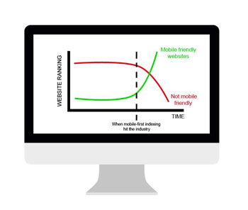
If your SEO rankings are poor, fewer people will see your website. Which means fewer conversions. By appealing to the Google algorithm, you’re actually just appealing to the humans it was designed so meticulously for – your customers, your future employees, the media and more.
Bottom line: Yes, people DO look at your website on their phone. And the easiest, most pain-free way to get people to see your content is to be a mobile friendly website.
“Nobody does B2B business on phones.”
B2B businesses in particular are often susceptible to something called “projection”. That’s when they make an assumption about how customers think based not on any concrete data, but on how they themselves think and feel.
As a business owner, you are not your target audience. You are not selling to yourself. You already know how great your solution is – the goal is to sell it to someone who doesn’t. Someone who hasn’t yet identified the problem that needs solving.
Maybe you don’t research B2B solutions on a mobile device. But a portion of your customers certainly do.
In B2B marketing, you must consider every potential point of contact – and a mobile channel is becoming an increasingly bigger piece of the pie.
Bottom line: Yes, people really do B2B business on their phones. If you don’t believe me, just ask your best competitors. You know, the ones getting the mobile-first customers that you’re ignoring.
How to Develop a Mobile Friendly Website
Now that you’re up to speed on the importance of why your webiste should be mobile friendly, it’s time to learn how to make the switch. Disclaimer: there is no actual “switch” that makes your website mobile friendly. Going from desktop-first to mobile-first requires a significant amount of thought and work – as does any strategy that’s worth your time.
At a high level, mobile friendly design is all about resizing and reordering content according to the screen – or viewport – size. This is called “responsive design.” That means it’s the web developer’s job to design (or redesign) a website with mobile devices in mind and then bring it to life through cascading style sheets (CSS).
Building responsiveness into a design depends on what CMS your website is programmed in. This is why a savvy developer is critical to making sure HTML elements display how you need them to online. Regardless, there are three things to keep in mind when designing a mobile friendly website from scratch (or appending to an old website):
- Stylesheet media inquiries
- Percentages
- Navigation
Let’s take a look at what each one means for your website.
CSS Media Inquiries
When building a responsive website, you’ll primarily find yourself working in two views: an HTML page and a CSS stylesheet. While the HTML page is the structure and content itself, the stylesheet controls the end look and feel of the website, ensuring that containers are organized properly.
To organize these containers, you have to write media queries into the stylesheet, creating scenarios, or “rules,” for individual layout items that dictate where they go at different breakpoints, or viewport sizes. (In English, this means stuff moves around when browser sizes and resolutions are different.) For example, if you have a two-column structure, you need to build a media query that instructs the program where to put each column when the viewport size changes.
On a laptop, your columns may look like this:


Though this may not seem like a significant adjustment, on the back end of things, it is.
In technical jargon, this is what these instructions look like:

(Yikes, right? That’s why you leave this stuff to a developer.)
Percentages
To create a mobile friendly website, instead of declaring the width and heights of objects in pixels, use percentages. (In other words, don’t say that something should be 200 pixels wide. Say it should cover 30% of the page.) Percentages allow for flexibility, which is a core concept of responsive websites.
If the shell of your website page is set to a specific number of pixels, the site will not play nice if a customer attempts to adjust its size. But if you describe a container’s size in percentages, the program can look at the viewport and change the container size accordingly.
Let’s go back to our column example from before.
On desktop, you may design it so that the left column is 33% of the viewport and the right is 66%, as illustrated below:

Additionally, you can tell the style sheet through another media query that if the viewport goes down to an iPad breakpoint, the columns should be sized 50/50. For an iPhone, you could create a rule for each column to be 100%:

Navigation
Last but not least, let’s talk about how to handle the navigation bar.
As everybody knows, the top or sidebar of the page is a great place to put a navigation bar – on desktop. But on mobile, that area is prime real estate. Keeping it in either place could disrupt all the other page containers.
That’s why the most common way to deal with the navigation bar is to suppress it, so it’s not crowding the viewport – like this:

Side note: If you want, you can take this a step further (and win a lot of Google points) by deploying AMP – Google technology designed to deliver content on any network as quickly as possible. This goes beyond being responsive and requires fundamental changes to the website code.
Conclusion: “Should my website be mobile friendly?” Yes!
Every business – B2C or B2B – should be thinking about mobile friendly website design. Ignoring this fact could mean ignoring up to half of your customer base.
The old rules of the web – written solely for a desktop experience – no longer apply. Mobile devices are fast, intuitive and make finding solutions to complex problems simple. But building a mobile friendly site takes experience. And if your website is not optimized for mobile and you don’t have the development chops to make it responsive, the best thing you can do is find a partner who does.
Altitude Marketing knows how B2B websites need to look, feel and react on all kinds of devices. We know because we’ve tested what works, and learned from what doesn’t, again and again. We’d love to chat. Contact us online, or call 610-421-8601 x122 to talk to one of our specialists today.
