Skip to content


If you’re a SaaS marketer, your landing pages’ conversion rates are important to you. Like, really important.
Landing page conversion rates are the lifeblood of any marketing campaign or launch. A good one sends ROAS through the roof. A bad one might have you looking for a job.
Conversion rates are always going to vary by industry, offer and audience. We’ve been happy with 0.5% conversion rates when the potential payoff is a seven-figure deal. We’ve also been annoyed with 5% conversion rates on simpler offers. It’s completely relative.
But sometimes you just hit a home run.
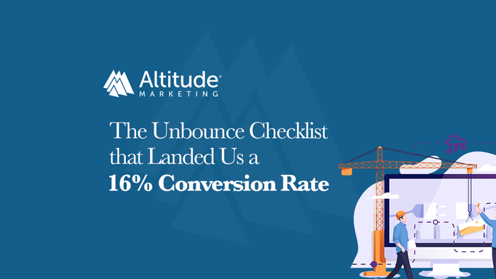
In this post, we’re going to break down a SaaS landing page that’s converting at 16.46%. According to Unbounce, the “average” landing page converts 4.02% of visitors. That means this page outperformed typical results by more than 300%.
Unbounce gave us early access to their newest eBook so we could test its SaaS landing page optimization checklist. And … yeah. It’s good.
(Full disclosure: We’re an Unbounce Partner. If you want to try their landing page builder platform, use this link to get 20-25% off your subscription.)
So let’s see why this page was such a success – and what you can take away for your business.

The Elements of a High-Performing Page
If you read this blog regularly, you know we’re unabashed fans of Unbounce. It’s software that lets you create and optimize landing pages in minutes. No code, no muss, no fuss – just drag and drop elements into place, launch and test.
Simple, right?
Well, not exactly.
Even the best landing page builder software isn’t going to create your content for you. It can’t connect with the buyer. And it sure as heck can’t give you a good product to sell.
Enter Shotzr.
Shotzr is the premier stock photo site for digital marketers. They’ve built a really interesting model. Their free “Social” tier offers fresh imagery from 1,300+ photographers around the world. For $99/month, you get about 72 million shots from Getty Images.
Pretty standard so far? Sure. But there’s more to Shotzr.
The real key to the platform is how it delivers images. On most free stock photo sites, you do a search and find something – usually junk. Shotzr images have tons of metadata behind the scenes. They’re tagged for location, content and more. That makes finding localized, personalized imagery a breeze. (And localized, personalized imagery drives a 20% increase in digital marketing engagement.)
So … good product. Check.
Shotzr recently rolled out the new version of their platform on a popular crowd recommendation site. The launch needed a landing page, and it needed to perform.
Enter the Unbounce SaaS optimization checklist.
12 Steps to a Better Conversion Rate
We’re not going to go through the entire eBook here. Things get a little blurry after the first few thousand words. Instead, we’re going to take you on a tour of our 12 favorite landing page conversion rate tips. We’ll show you how we applied them to the page – and how they helped us drive a ton of new users.
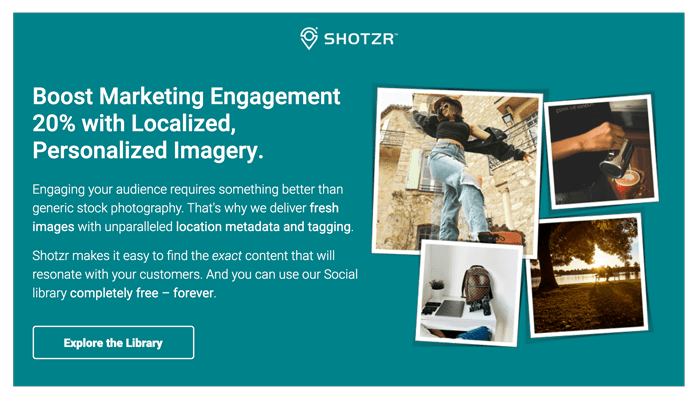
Here’s the landing page we’ll be talking about.
Tip #1: Research Your Audience
This seems obvious, but a lot of marketers forget it. They build a page that reflects what they want, not what their prospects want. To hear Unbounce tell it:
“A high-converting landing page answers your prospect’s innermost questions. It addresses their concerns. Identifies what’s going on. It tells the visitor’s story. In the way they need to hear it.”
See the focus on the audience? That’s a drum we beat over and over again on this blog – and for good reason. Marketing isn’t about the marketer. It’s about the buyer.
In this case, the landing page was supporting a crowd launch. That’s a tight-knit global community with some pretty specific mores. They don’t want BS, and they don’t have a ton of time to waste.
To succeed on crowd recommendation sites, you need to make your message clear. And you need to offer the community something of value. If you’re self-serving, you fail.
In this case, we went with an exclusive coupon code and an obvious link to the free version of the product. Both benefit the user – a key tenet of the community.
Connection achieved.
Tip #2: Offer a Unique Value Proposition in the Hero
Landing page visitors need to learn what makes you special immediately. Like, as soon as they hit the page. If you don’t drive your value proposition home from the jump, your conversion rate will suffer.
Here, the value prop for the target audience was obvious. Shotzr focuses on delivering real-world marketing success – not just images. And they have the numbers to back it up.
As a result, our headline didn’t read “Free Stock Photos.” It was “Boost Marketing Engagement 20% with Localized, Personalized Imagery.” That’s two differentiators in one – and a hugely impactful brand promise.
Tip #3: Point to a Clear Call-to-Action
Doesn’t get much simpler than this. The landing page makes it extremely clear what users are supposed to do.
The beauty is that it doesn’t try to trick users. It’s calling them to actions that would actually benefit them. They can explore the image library for free, or sign up for a discounted “Plus” subscription. Both options are available in big, bold and obvious buttons.
Tip #4: Support the Value Proposition with Copy
Just like the hero, the story on the landing page isn’t generic. It’s specific to the platform’s core USP: fresh imagery that drives business results. It’s not just that it’s pretty – though it is. We hit on metadata, delivery mechanisms and audience resonance.
The message is obvious: If you need stock photography to support digital marketing efforts, there’s no other choice.
Tip #5: Use a Friendly, On-Brand Tone
Digital marketers, particularly at SMBs, aren’t a very formal bunch. That made Shotzr’s playful-yet-professional tone shine. No jargon, a joke or two – the language draws the user in, rather than turning them off.
Tip #6: Make it Easy to Read
This applies to both visuals and language.
On the visual side, text size and color contrast are key, particularly on mobile. If it’s too small or doesn’t stand out, it’s hard to read. That’s bad.
On the language side, we shot for our typical middling reading level. You’ll see a lot of different stats here, but maxing out around an eighth-grade reading level is usually about right. (For reference, this post is around a fifth-grade level.)
Avoid unnecessarily big words and complex sentences. Much as this pains me, semicolons are the enemy of good landing page conversion rates.
Tip #7: Tell the User’s Story
Remember, they’re not here to hear about you. They’re here to hear how you can help them.
In this case, the users on the page were mostly digital marketers. They want better images to improve engagement. And they want some proof that it works. The landing page provided all of that – giving them the tools to be the hero of their own story.
Tip #8: Provide Social Proof
See those logos? That’s social proof. It’s one thing for us to say we’re great. It’s another entirely for someone else to say it. (As a bonus, this makes your valuable PR media hits work that much harder.)
Tip #9: Use Named Testimonials
If someone’s saying something great about you, make sure you amplify their comments. In this case, unsolicited crowdsourced quotes made for great landing page fodder.
People feel comfort in packs. Nobody wants to be on an island. They want their decisions to be supported by like-minded individuals. Landing page testimonials provide that.
Tip #10: Make the CTA Directly Relevant
Think about the intent of a user on this landing page. They clicked to learn more about a stock photo site for digital marketers. That means they want …
Photos!
If the CTA had promised a demo or a webinar or a conversation with sales, it wouldn’t have worked. The call-to-action on a high-converting landing page must match the user’s intent. In this case, they wanted imagery, and we gave them imagery.
Tip #11: Reflect the Value Proposition in the Hero Image
What are we promising here? Good imagery that engages an audience. What are we showing? Good imagery that engages our audience.
(And granted it’s not in the hero, but a solid dog-in-the-snow photo never hurts. He’s a good boy.)

Tip #12: Make Conversion Seamless
Nobody wants to jump through hoops. The smaller the form – or even no form – the better. Make the conversion process obvious and simple. Tell the user what they’re going to get and deliver instantly.
Get Your Own High-Performing Landing Page
There’s no magic bullet when it comes to a great landing page conversion rate. And as we noted earlier, “great” is highly subjective. But if you follow these tips, you’ll be on your way to more users and leads.